Most websites nowadays have light mode, dark mode, and a system adaptive mode. It’s pretty trivial to implement this in Svelte.
In this post I will use my personal website as an example to show how to implement this feature.
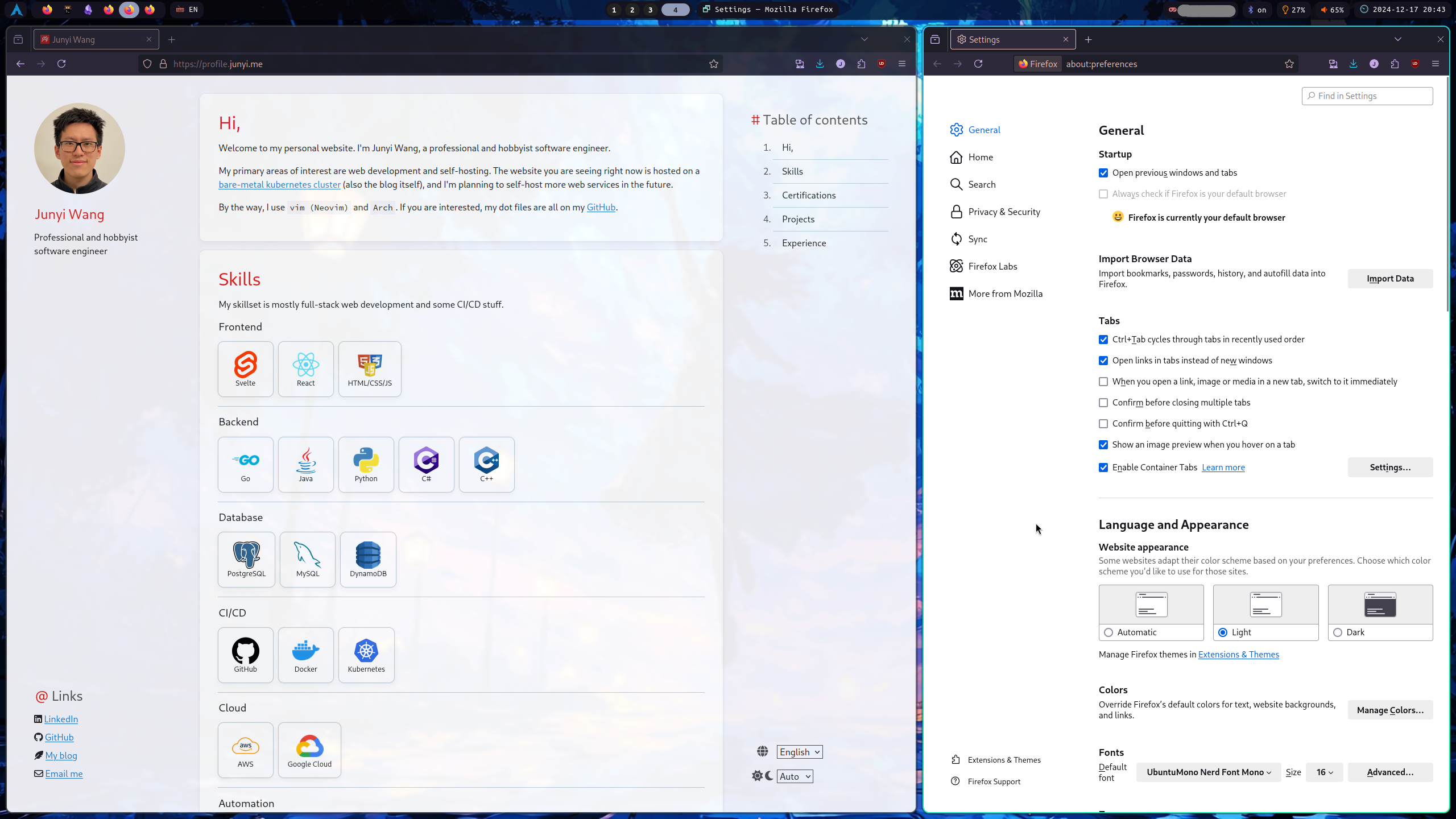
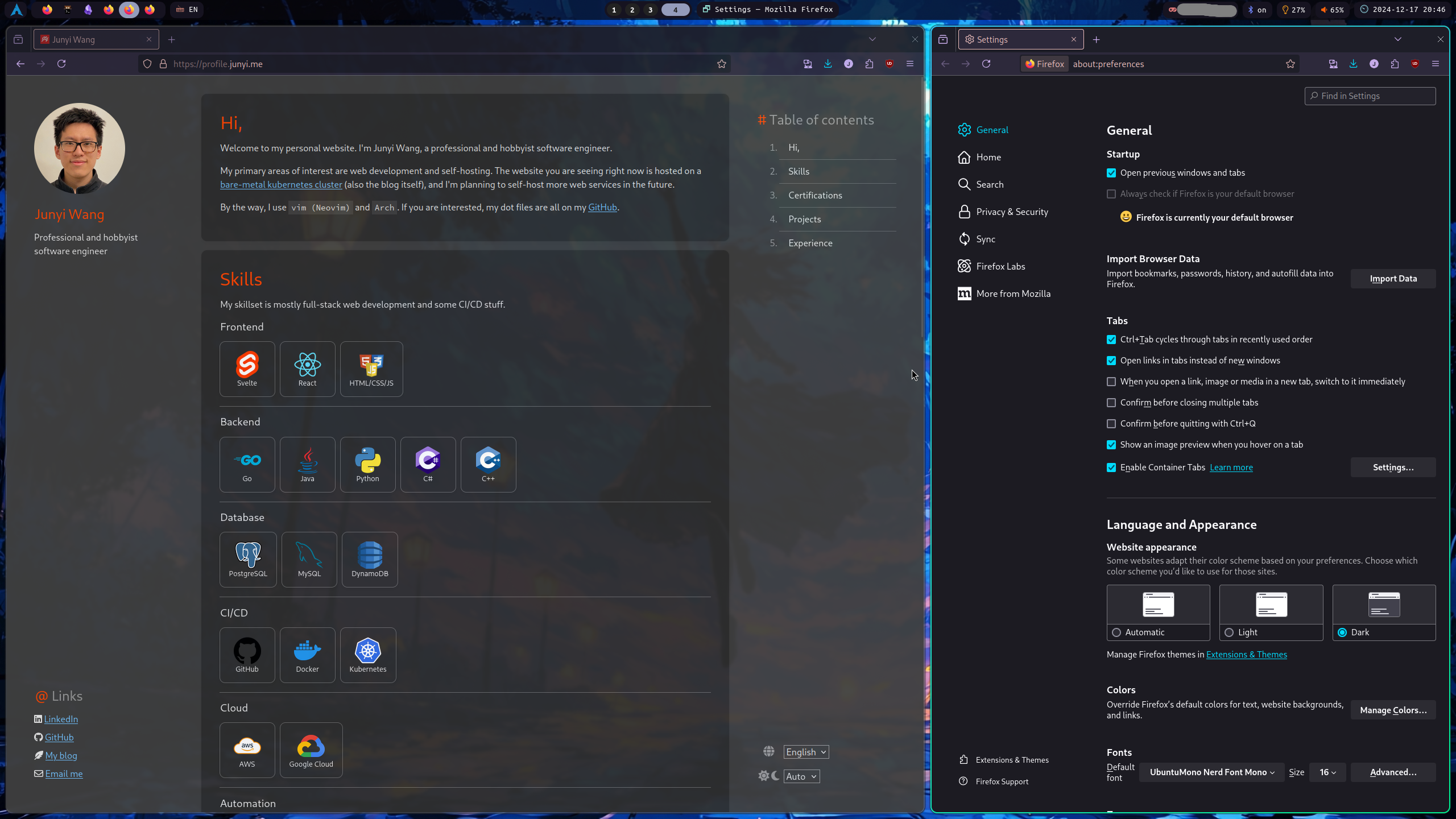
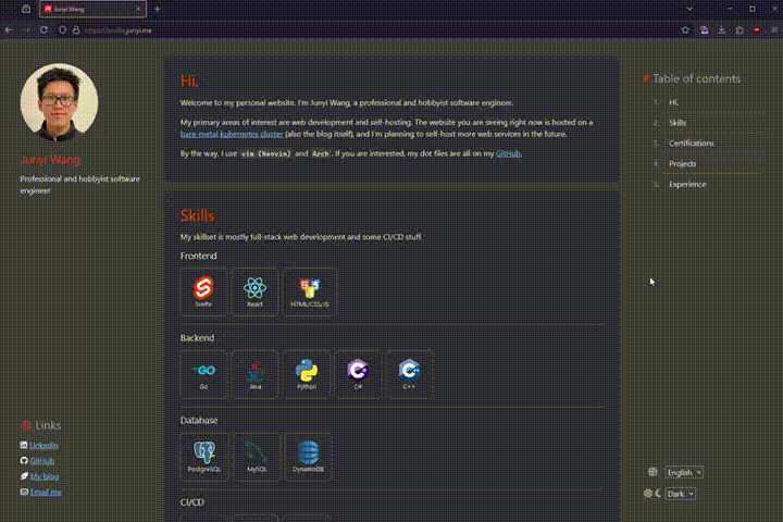
Demo
Implementation
This implementation works, but it has an issue: when loading into the page with system theme set to dark, the page flashes white for a second before switching to dark mode.
For a better implementation, see this post
There are three parts to this implementation:
- CSS
- Svelte component
- Svelte store
The git repository for this project is public, and can be found here.
CSS
First, define a global CSS file to store all the color variables.
I find it easier to manage the color variables all in the body tag, so I can access them in any CSS snippet in any CSS file or Svelte component.
 1
 2
 3
 4
 5
 6
 7
 8
 9
10
11
12
13
14
15
16
17
18
19
20
21
22
23
24
25
26
27
28
29
30
31
32
33
34
35
36
|
/* global.css */

body {
    --bg-1: hsl(0, 0%, 100%);
    --bg-2: #f5f5fa;
    --bg-3: hsl(206, 20%, 80%);
    --bg-4: #edf1f5;
    --fg-1: hsl(0, 0%, 13%);
    --fg-2: hsl(0, 0%, 20%);
    --fg-3: hsl(0, 0%, 30%);

    --highlight: #ffffcc;
    --accent: #E2211C;

    --link: hsl(208, 77%, 47%);
    --link-hover: hsl(208, 77%, 55%);
    --link-active: hsl(208, 77%, 40%);

    /* ...*/
}

body.dark {
    --bg-1: hsl(0, 0%, 18%);
    --bg-2: #3f3f3f;
    --bg-3: hsl(0, 0%, 40%);
    --fg-1: hsl(0, 0%, 90%);
    --fg-2: hsl(0, 0%, 70%);
    --fg-3: hsl(0, 0%, 60%);

    --highlight: #4c4c3c;
    --accent: #ff4500;

    --link: hsl(206, 96%, 72%);
    --link-hover: hsl(206, 96%, 78%);
    --link-active: hsl(206, 96%, 64%);
}
|
Then import it in the main HTML file.
1
2
3
4
|
<!-- app.html -->
    <!-- ... -->
    <link rel="stylesheet" href="global.css">
    <!-- ... -->
|
Svelte store
Next, we need a Svelte store to keep track of the user’s preference. Here, localstorage is used to persist the preference.
 1
 2
 3
 4
 5
 6
 7
 8
 9
10
11
12
13
14
15
16
17
18
19
20
21
22
23
24
25
26
27
28
29
30
|
// stores.ts

import { writable, type Writable } from 'svelte/store';

// Possible theme options
export type ThemeType = 'light' | 'dark' | 'auto';

// Preference store: any other preference can be added here
export type PrefType = {
  theme: ThemeType;
}

// Store type: this is the object that will be stored in localstorage
export type StoreType = {
  pref: PrefType;
}

// Initialize the store
const stored = localStorage.content;
const store: Writable<StoreType> = writable(stored ? JSON.parse(stored) : {
  pref: {
    theme: 'auto',
  }
});

store.subscribe(value => {
  localStorage.content = JSON.stringify(value);
});

export default store;
|
Svelte component
Finally, create a Svelte component to let user select the color theme.
The gist is to use prefers-color-scheme media query to detect the user’s system preference. If the user selects a specific theme from dropdown, it will override the system preference.
For the dropdown component, I created my own with i18n support. The code is available here, but any dropdown component will work.
 1
 2
 3
 4
 5
 6
 7
 8
 9
10
11
12
13
14
15
16
17
18
19
20
21
22
23
24
25
26
27
28
29
30
31
32
33
34
35
36
37
38
39
40
41
42
43
44
45
46
47
48
49
50
51
52
53
54
55
56
57
58
59
60
61
62
63
64
65
66
67
68
69
70
|
<!-- Preference.svelte -->

<script lang="ts">
  import Card from "$lib/Card.svelte";
  import { onDestroy } from "svelte";
  import store, { type ThemeType } from "./stores";
  import Dropdown from "./Dropdown.svelte";

  let { onConfirm = () => {} }: { onConfirm?: () => void; } = $props();

  const switchColor = (dark: boolean) => {
    if (dark) {
      document.body.classList.add('dark');
    } else {
      document.body.classList.remove('dark');
    }
  };

  const mediaQuery = window.matchMedia('(prefers-color-scheme: dark)');
  let switchFn: ((e: MediaQueryListEvent) => void) | null = null;

  const switchTheme = (theme: ThemeType) => {
    if (theme === 'auto') {
      // Add the listener only if it doesn't exist
      if (!switchFn) {
        switchFn = (e: MediaQueryListEvent) => switchColor(e.matches);
        mediaQuery.addEventListener('change', switchFn);
      }
      // Set the initial color based on current preference
      switchColor(mediaQuery.matches);
      return;
    }

    // Remove the listener if switching to a specific theme
    if (switchFn) {
      mediaQuery.removeEventListener('change', switchFn);
      switchFn = null;
    }
    // Manually set the theme
    switchColor(theme === 'dark');
  };

  // Subscribe to store changes
  const unsubscribe = store.subscribe(store => {
    // theme
    const theme = store.pref.theme;
    switchTheme(theme);
  });

  // Cleanup on component destroy
  onDestroy(() => {
    if (switchFn) {
      mediaQuery.removeEventListener('change', switchFn);
    }
    unsubscribe();
  });

  // Theme options
  type themeOptType = { value: ThemeType, txLabel: string };
  let themeOptions: themeOptType[] = [
    { value: 'light', txLabel: 'pref.colorTheme.light' },
    { value: 'dark', txLabel: 'pref.colorTheme.dark' },
    { value: 'auto', txLabel: 'pref.colorTheme.auto' },
  ];

</script>

<!--...-->
<Dropdown bind:selected={$store.pref.theme} options={themeOptions} onChange={onConfirm} />
<!--...-->
|